I defined a scalable system of design libraries, layouts, and components to reduce design and technical debt for a lean startup team.

How might we improve team efficiency and satisfaction through a shared design system?
I was hired as the second designer on Expert Institute’s product team. Until I came on board, there was no need to share designs because the design team was literally one person. We needed a design system to unite our teams around a common visual language, enabling and facilitating collaboration and consensus.
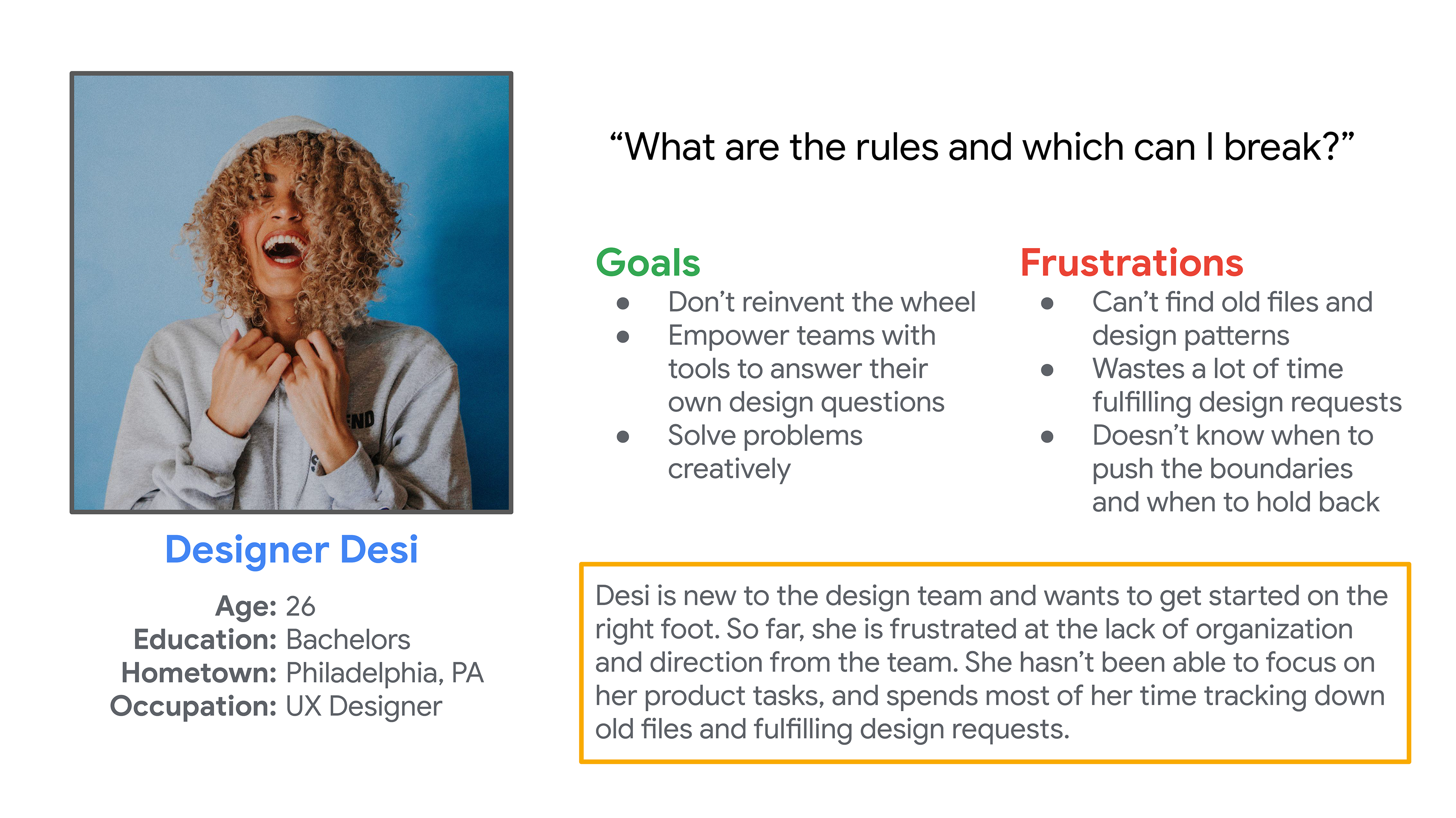
Persona for the primary user: the designer! (Photo by Ivana Cajina on Unsplash)
Learning from the team
I began to take note of pain points that team members brought up in team meetings and one-on-one conversations. Before long, recurring themes began to surface from both the Engineering and Marketing teams: they wanted organization and direction.

Empathy map for the Engineering team
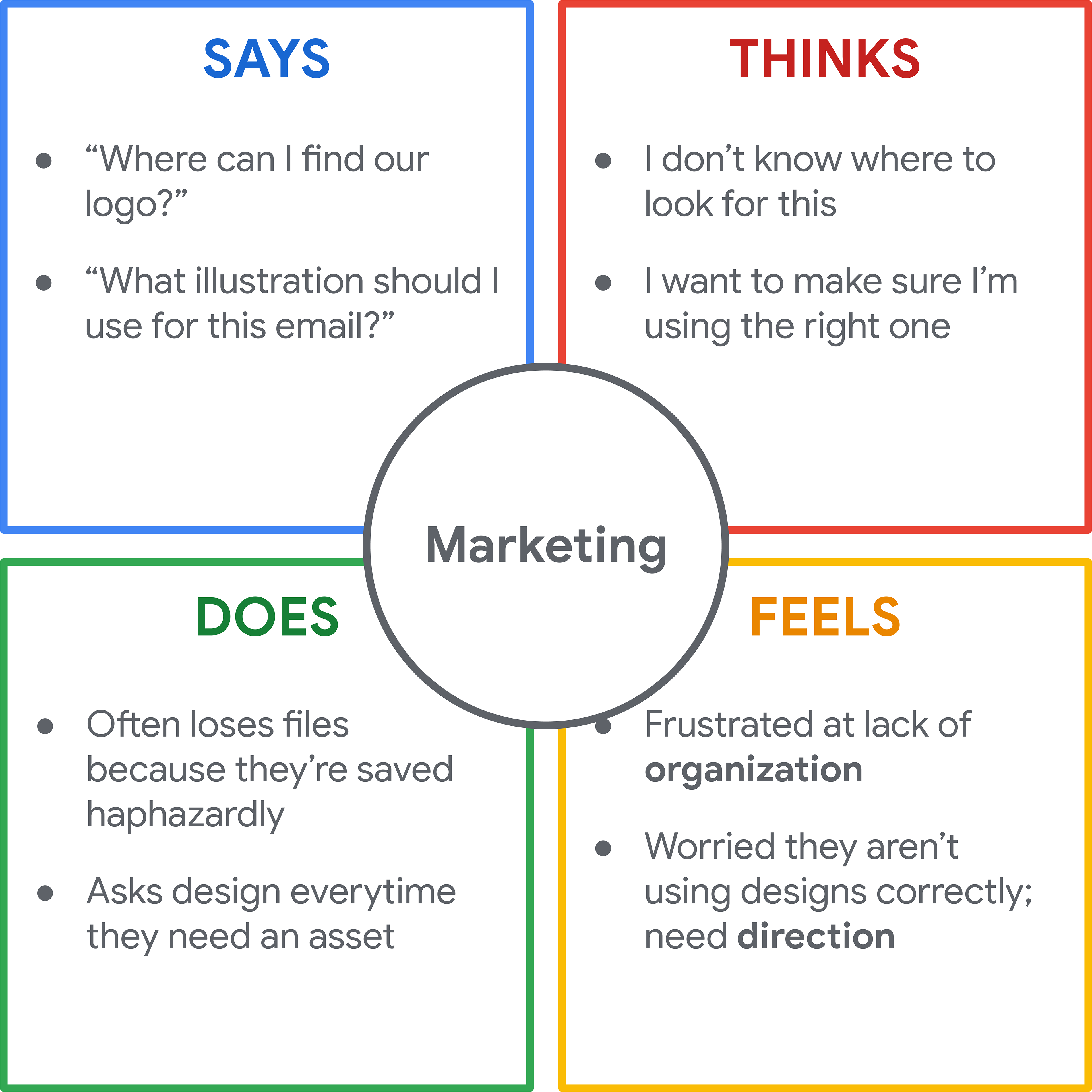
Empathy map for the Marketing team
Prioritizing parts, products, and people
To make sure we drew boundaries of what the system would become, we tried Nathan Curtis' fun activity. We agreed our design system would offer visual style, accessible UI components, UX patterns, branding, and iconography released as Figma, Adobe Xd, and other PDF templates in order to serve ~10 web-based products and experiences.

We used this worksheet from Nathan Curtis
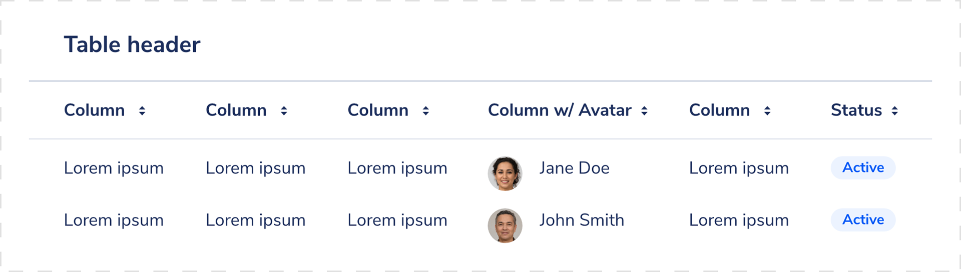
Auditing UI components
After Kate and I divided up our tasks and logged them in Jira, I began taking inventory of our visual attributes and our UI elements. I took a lot of screenshots and wondered: do we really need this many types of buttons? Surfacing and categorizing components across the web app allowed us to see the inconsistencies between pages as well as what components they had in common.
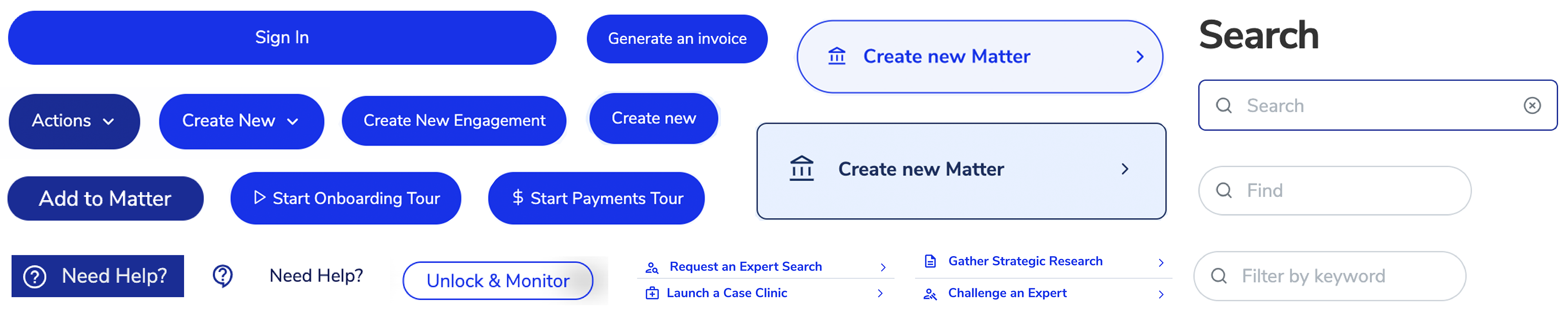
UI audit
Iterating new styles
I started out by mocking up our UI elements in a medium-fidelity wireframe kit in Figma. Using multiple fidelities allowed us to work faster and stay focused on improving usability. We've used the kit on many projects since.
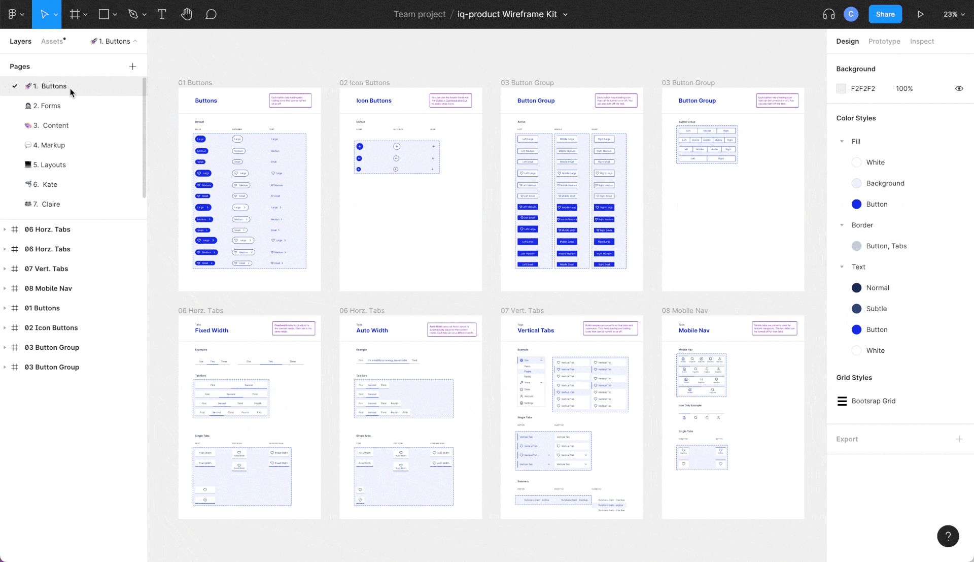
Figma wireframe kit
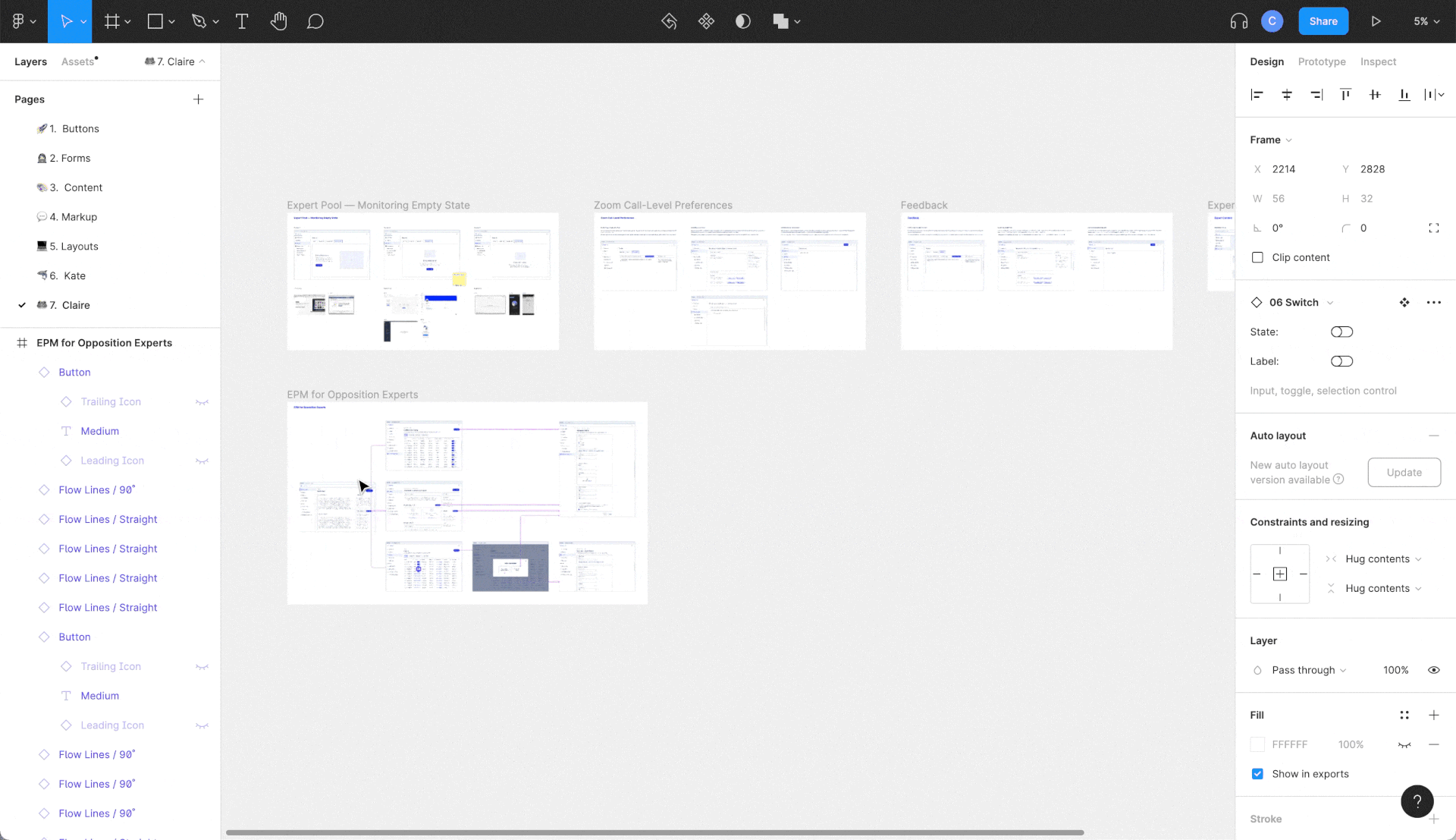
Component linking
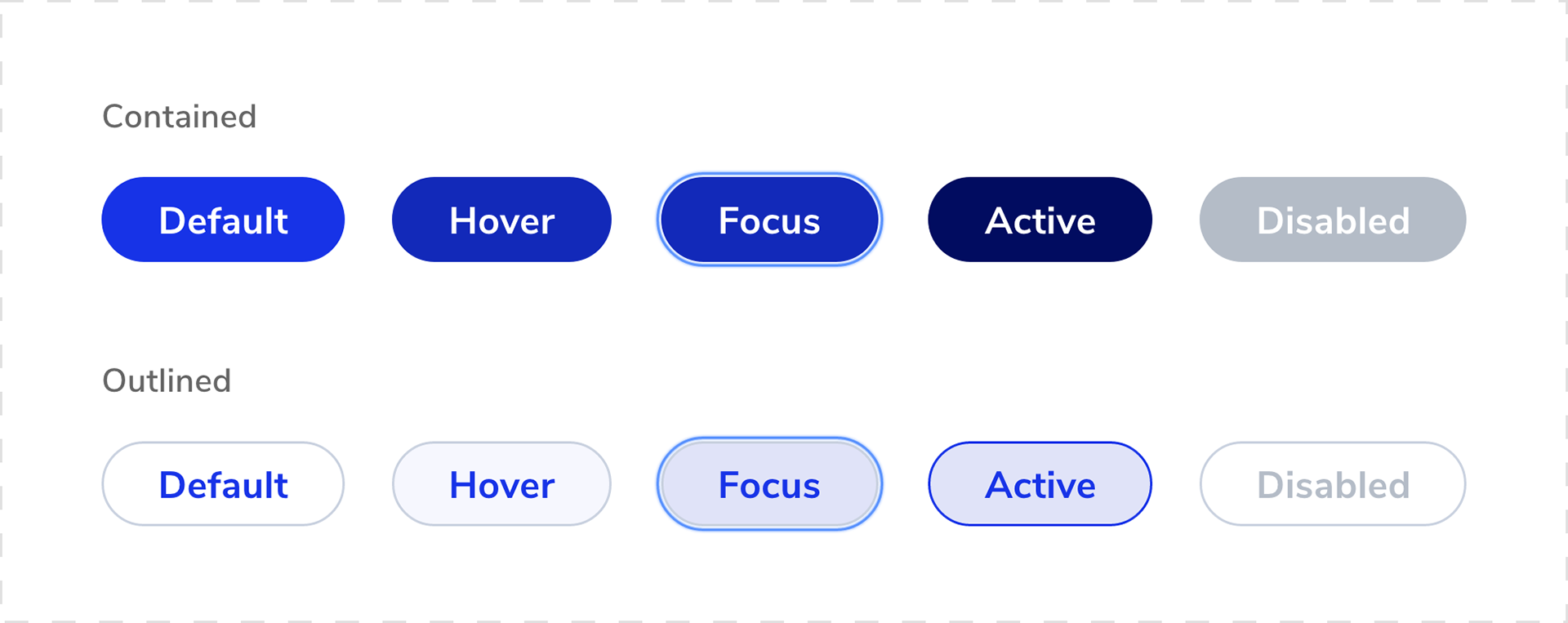
Defining new styles
We defined and shared UI specs to give our engineering team organization and direction when picking up new work.
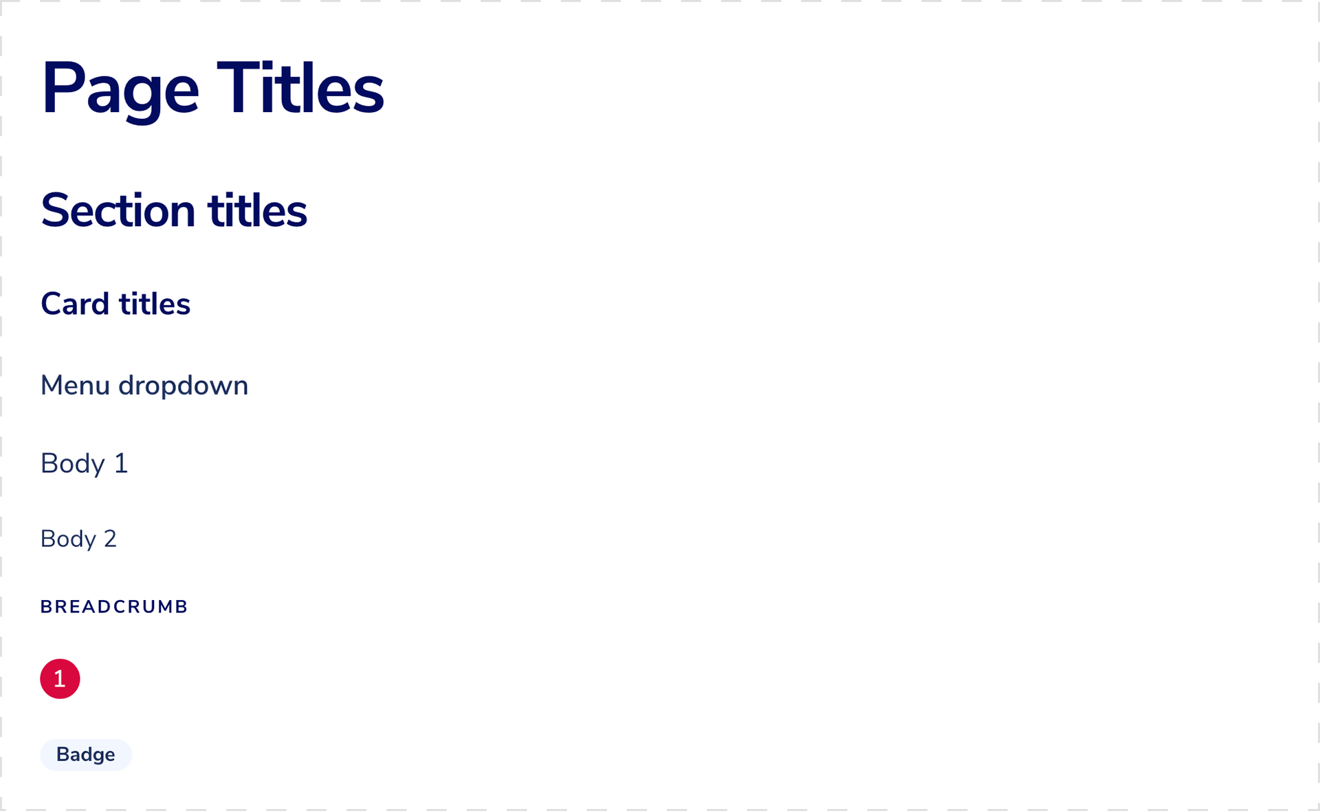
Nunito Sans font
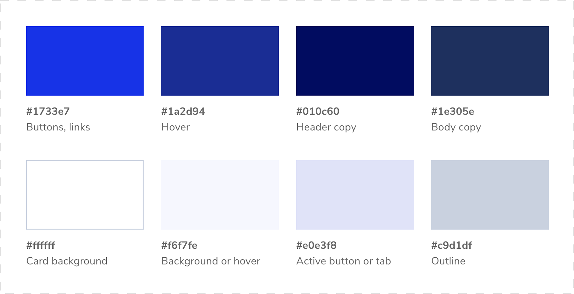
Primary colors for text, backgrounds, buttons

Secondary colors for badges
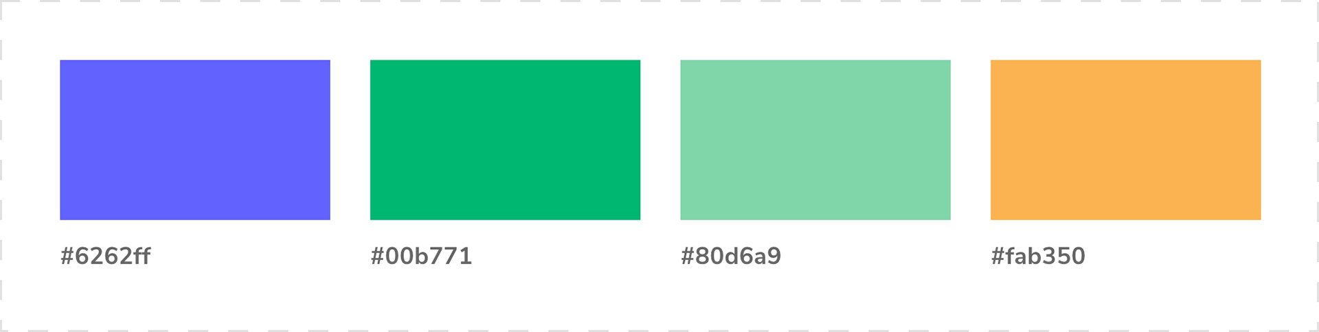
Tertiary colors from the color palette
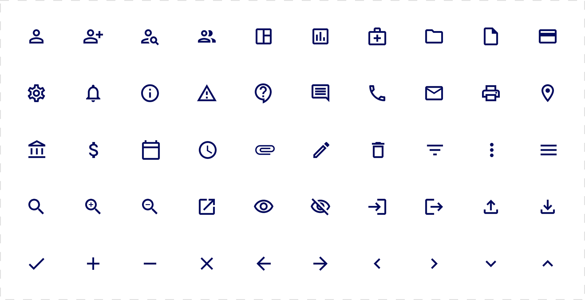
Material Design icon font
Two illustrations for marketing collateral, designed by our Senior Graphic Designer

Results
The system has reduced design and technical debt significantly, saving our team about 12+ hours per week. We waste less time trying to resolve redundancies and locate important assets. We have time for more valuable conversations around product strategy.
Learnings
A design system is living and this one has grown and changed over time. I set myself weekly reminders to review and update the style guide.
Testimonial
“This system has totally changed the way I work through my design process and collaborate with the rest of the team. I especially love the Figma wireframes because they help me focus on the user experience and make changes more efficiently."
✎ Kate Rice, Associate Director of Product Design
Thank you
Woah, you made it all the way here. Thanks for reading! Want to geek out about design systems? Say hi at clairemsquire@gmail.com.